# カード作成(自己紹介)
NOTE
このページでは、なるべくコピー & 貼り付けではなく、自分でタイピングして入力しましょう。
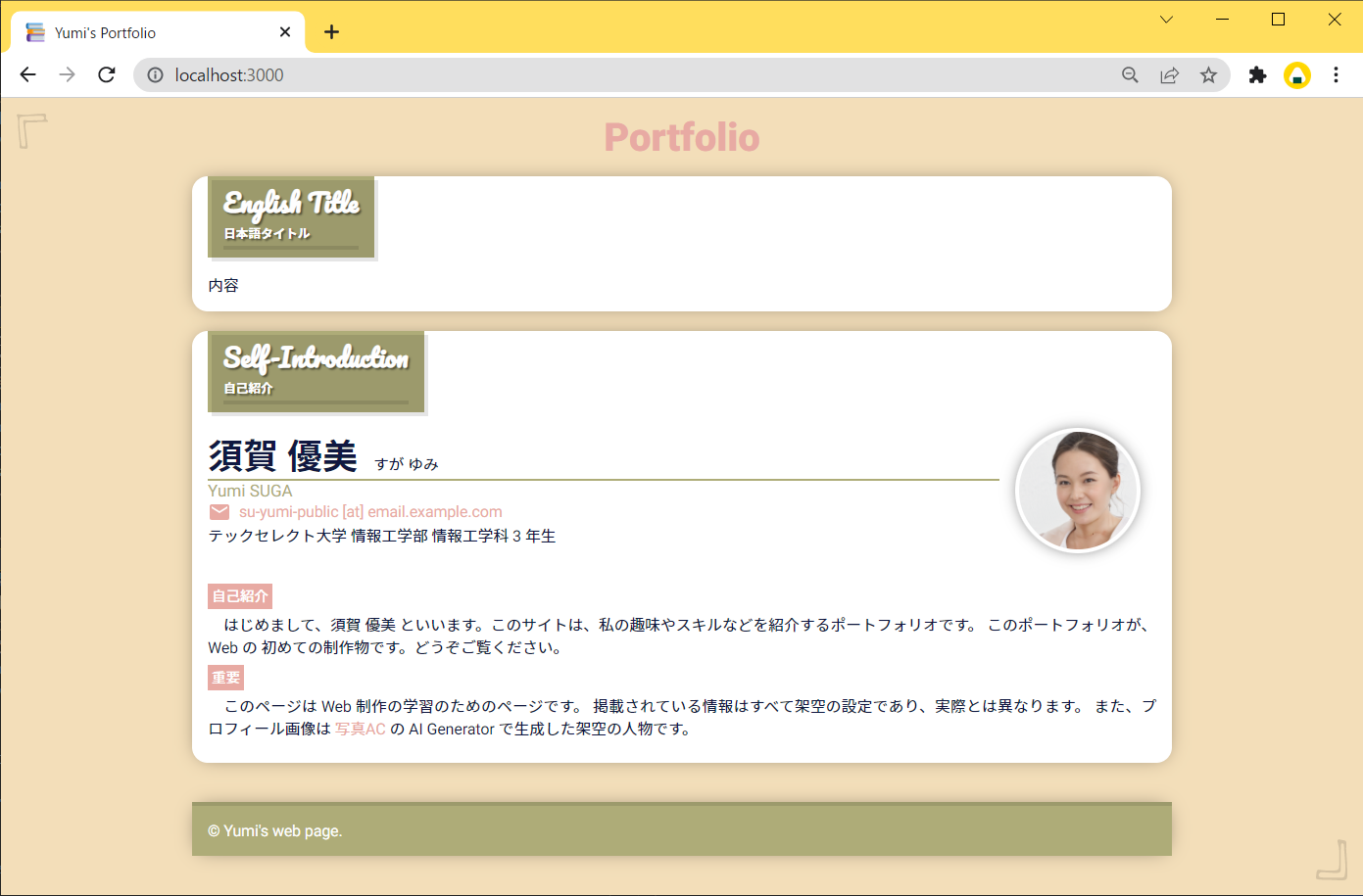
自己紹介のカードを作成していきます。 ここまでに作成した、ベースとなるカードはテンプレートとして、しばらく消さずにおいておきましょう。 以下のような自己紹介カードを作成する予定です。
# 内容
このページに記載する内容は以下の通りです。 カードとカードの間は、適宜スペーサーとして空のブロックタグを入れておきます。
<div style="height: 20px"></div>
Q. 空のタグは良くないと聞きました。
A. ここでは、スペーサーの役割として、空の <div /> (中に何も記載がないタグ)を使用しています。
本来であれば、Style の margin 等を使用してレイアウト調整する必要があります。
しかし、この学習サイトでは単純化のために使用し、またそれに対する妥当性は議論しません。詳細 (opens new window)
~~/public/index.html
<div class="page-cover bg-3 text-dark">
<h1 class="page-title text-1">Portfolio</h1>
<div class="card-cover bg-white">
<h2 class="card-title-cover bg-2 text-light">
<div class="card-title">English Title</div>
<div class="card-subtitle">日本語タイトル</div>
<div class="card-title-line"></div>
</h2>
<div class="card-contents">内容</div>
</div>
<div style="height: 20px"></div>
<div class="card-cover bg-white">
<h2 class="card-title-cover bg-2 text-light">
<div class="card-title">Self-Introduction</div>
<div class="card-subtitle">自己紹介</div>
<div class="card-title-line"></div>
</h2>
<div class="card-contents">
<div class="card-basic-info-layout">
<div>
<img src="./assets/me.png" alt="顔写真" class="my-photo" />
</div>
<div style="flex-grow: 1">
<div style="display: flex; gap: 1em; align-items: flex-end">
<h3 style="margin: 0; font-size: 2rem">須賀 優美</h3>
<span style="padding-bottom: 4px">すが ゆみ</span>
</div>
<div class="bg-2" style="height: 2px"></div>
<div class="text-2" style="font-size: 0.95rem">Yumi SUGA</div>
<div
class="text-1"
style="display: flex; gap: 0.5em; align-items: center"
>
<img src="./assets/icons/email.svg" alt="Email のアイコン" />
<span>su-yumi-public [at] email.example.com</span>
</div>
<div>テックセレクト大学 情報工学部 情報工学科 3 年生</div>
</div>
</div>
</div>
<div class="card-contents">
<span class="card-basic-info-label bg-1 text-light">自己紹介</span>
<p>
はじめまして、須賀 優美
といいます。このサイトは、私の趣味やスキルなどを紹介するポートフォリオです。
このポートフォリオが、Web の
初めての制作物です。どうぞご覧ください。
</p>
<span class="card-basic-info-label bg-1 text-light">重要</span>
<p>
このページは Web 制作の学習のためのページです。
掲載されている情報はすべて架空の設定であり、実際とは異なります。
また、プロフィール画像は
<a href="https://www.photo-ac.com/">写真AC</a> の AI Generator
で生成した架空の人物です。
</p>
</div>
</div>
<div style="height: 40px"></div>
<footer class="footer-cover bg-2 text-light">
<div style="height: 4px; background-color: rgba(0, 0, 0, 0.1)"></div>
<div class="footer-contents">© Yumi's web page.</div>
</footer>
</div>
</body>
2
3
4
5
6
7
8
9
10
11
12
13
14
15
16
17
18
19
20
21
22
23
24
25
26
27
28
29
30
31
32
33
34
35
36
37
38
39
40
41
42
43
44
45
46
47
48
49
50
51
52
53
54
55
56
57
58
59
60
61
62
63
64
65
66
67
68
69
70
71
72
~~/public/assets/main.css
/* ===== CARD COMMON END ===== */

/* ===== CARD | SELF-INTRODUCTION BEGIN ===== */
.card-basic-info-layout {
  display: flex;
  flex-direction: column;
}
@media screen and (min-width: 500px) {
  .card-basic-info-layout {
    flex-direction: row-reverse;
  }
}
.my-photo {
  display: block;
  border-radius: 50%;
  box-shadow: 0 0 16px -4px rgba(0, 0, 0, 0.7);
  max-width: 120px;
  padding: 4px;
  background-color: white;
}
@media screen and (max-width: 500px) {
  .my-photo {
    margin: 16px auto;
  }
}
@media screen and (min-width: 500px) {
  .my-photo {
    margin: 0 16px;
  }
}
.card-basic-info-label {
  font-size: 0.8rem;
  font-weight: 500;
  padding: 4px;
}
/* ===== CARD | SELF-INTRODUCTION END ===== */
2
3
4
5
6
7
8
9
10
11
12
13
14
15
16
17
18
19
20
21
22
23
24
25
26
27
28
29
30
31
32
33
34
35
36
# Display
Style の display プロパティについて、特に 値 : flex について説明します。
CSS では、要素には必ず display プロパティの値が設定されています。
本学習サイトで使用する値としては以下のようなものがあります。
display: block;display: inline;display: inline-block;display: flex;display: grid;
また、特に指定していない場合でも、デフォルトで決まっています。
display: block; がデフォルトで指定されているものには次のようなタグがあります。
<div><p><ul>、<ol><h1>~<h6>
display: inline; がデフォルトで指定されているものには次のようなタグがあります。
<span><a><small><img>
これらの要素は、Style を指定することで、上書きできます。以下はその例です。
<div>これはブロック要素です。</div>

<span> これはインライン要素です。 </span>

<div style="display: inline;">これはインライン要素になります。</div>

<div style="display: inline-block;">
  これはインラインブロック要素になります。
</div>

<span style="display: block;"> これはブロック要素になります。 </span>
2
3
4
5
6
7
8
9
10
11
# display:flex;
flex は、特定の要素に指定すると、その直下の要素が領域に収まるように伸長・収縮します。
以下の例を確認してください。子要素の変更をすることなく、レイアウトが変更されていたり、
表示領域の割合が決められていたりします。
See the Pen Untitled by Insell (@insell824) on CodePen.
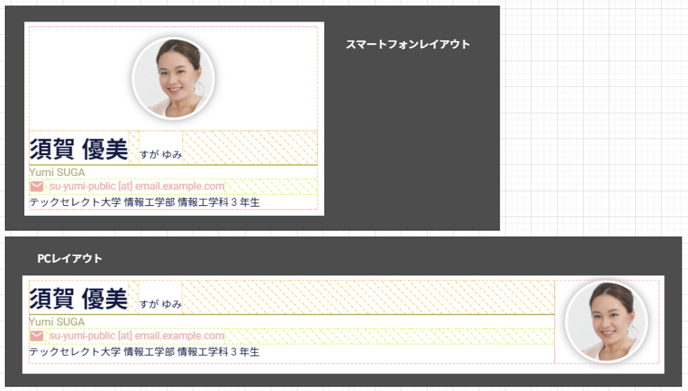
スマートフォンでは、1 カラムレイアウトにし、PC では 2 カラムレイアウトにします。 PC 画面の 2 カラムレイアウトは、 下の画像において、テキストとプロフィール画像で列が分割されている部分を示しています。
以下のように記載することにより、画面幅によって flex-direction を変更しています。
.card-basic-info-layout {
  display: flex;
  flex-direction: column;
}
@media screen and (min-width: 500px) {
  .card-basic-info-layout {
    flex-direction: row-reverse;
  }
}
2
3
4
5
6
7
8
9
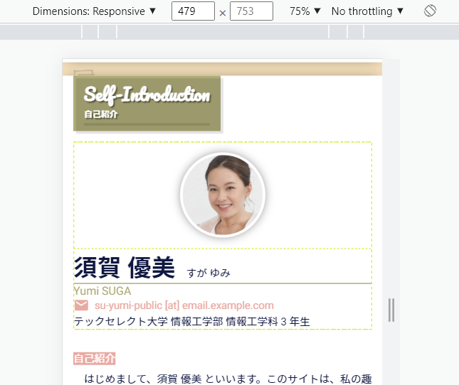
この書き方は、横幅が 500px 未満か 500px 以上かを、メディアクエリで切り替えています。 横幅が 500px 未満のときは以下のように記述したことになります。
.card-basic-info-layout {
  display: flex;
  flex-direction: column;
}
/* @media screen and (min-width: 500px) の内容は適用されない */
2
3
4
5
表示結果は以下のようになります。
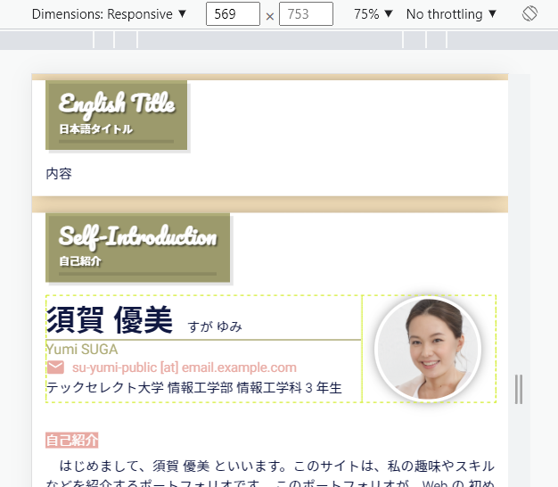
横幅が 500px 以上のときは以下のように記述したことになります。
.card-basic-info-layout {
  display: flex;
  flex-direction: column;
}
/* @media screen and (min-width: 500px) の内容も適用される */
.card-basic-info-layout {
  flex-direction: row-reverse;
}
2
3
4
5
6
7
8
CSS では、あとに記載したほうが適用されるため、結果的に以下のように認識されます。
.card-basic-info-layout {
  display: flex;
  flex-direction: row-reverse;
}
2
3
4
表示結果は以下のようになります。
他にも同様に flex を適用している部分があります。 指定した Style がどのように適用されているかは、 ブラウザの検証機能を使用して確認してください。